My Thoughts on Netflix’s Fear Street Prom Queen Posters
Fear Street Prom Queen Posters Are A Blast From the Past
I’ve covered this movie a couple times before, when Netflix released the first pictures and the teaser and release date. I wasn’t planning to discuss it again until the full trailer came out. But, let’s face it, I’m a Fear Street fanboy, and if Netflix keeps churning out fun promotional material, I’m gonna keep blabbing about it!
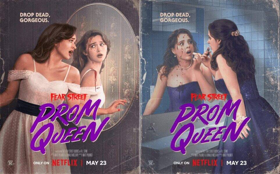
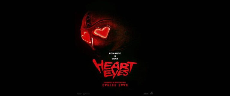
The new Fear Street Prom Queen posters take inspiration from the classic art of the original ’90s books.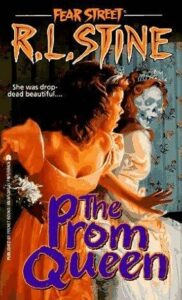 Both have the slogan “drop dead gorgeous”. Obviously, Netflix is going for a double meaning here, referring to both the girls’ beauty and the fact that they’re being hunted by a killer. It’s also similar to the novel’s tagline, which is “She was drop dead beautiful.”
But “drop dead gorgeous” is also the perfect way to describe these posters! The original Fear Street series had fantastically creepy cover art.
This was one of the main selling points of the books. It helped them stand out on crowded book store shelves. Unfortunately, the quality of book covers (and movie posters) has generally declined significantly since the ’80s and ’90s.
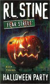
For example, take a look at the difference between the cover for the original Fear Street: Halloween Party (left) and the reissue.
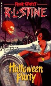
The original has so much more detail and effort put into it. We have a frightened girl in a cape being menaced by a floating jack-o-lantern, with a grave in the foreground and a creepy house behind her. I love the mix of red, black, white, and gold that the artist used.
Then, in the reissue, they just went with a generic jack-o-lantern image. It’s ironic because graphic design technology is way better now. I could go into my free basic Canva account and make something better than the reissue cover!
I’m glad that Netflix recognized the popularity of the original covers and imitated them for the Fear Street Prom Queen posters. The movie hits Netflix on May 23rd.


One Comment
Comments are closed.